Logo for Dr Anna Clemens PhD who teaches scientific writing courses for researchers

Designing an Engaging Conference Poster Step by Step

Designing an Engaging Conference Poster Step by Step

Far too many scientists miss an opportunity when they present their posters at conference. In this guest post, Dr. Tullio Rossi from Animate Your Science gives step-by-step instructions to design an award-winning conference poster.

Before we get started, I want you to think about three things that you know about scientific posters. Think hard now.

Done? Great! Now erase those ideas from your memory. F O R E V E R. We need to start fresh.

The problem is that 90% of the scientific posters that you’ve seen at conferences and in the corridors of your university are TERRIBLE. I mean VERY TERRIBLE!!! Therefore, any ideas you might have about what a scientific poster should look like are probably, well. . . terrible. But it’s not your fault, and we’ll set things straight in this post, so hang tight!

First off, let’s make clear what a poster is NOT.

A poster is not a bottomless pit where you dump all of your data and technical lingo. Only carefully selected information and visuals should go into your poster. I know you have eight fancy 3D plots that you can’t wait to share with the world, but ask yourself, are they really necessary? Do you really need eight of them when just one would do the trick?

A template for conference posters

Now let’s talk about what a poster should be instead. Above all, a poster should be a networking tool. The primary purpose of a poster is not to communicate every little detail of your fantastic research, but rather to attract people’s attention and serve as a conversation starter. Think about the typical conference poster session; it’s at the end of the day, and there is often copious amounts of alcohol in the mix. Seriously, after a long day of presentations, no one wants to read walls of text as the wine kicks in. What they want is for you to share the story of your research and engage in informal conversation about it. Repeat after me, a poster is a conversation starter. And the poster is not going to do the talking for you.

Second, a poster is a communication tool. A poster should use visuals to draw people in from a distance. Then, as people step closer and begin reading it, go ahead and give the background information necessary so that they can put your work into context, understand what you have done, why you have done it, and come to realize its broader impact.

Does this ring a bell? It’s no coincidence that the key information you’d include in your poster is the same information that you’d find in any scientific abstract. And here’s the secret: a scientific poster is simply a visual abstract. It’s also known as a graphical abstract. A concise and visual summary of your research. Its purpose is to be accessible and to drive attention to your research.
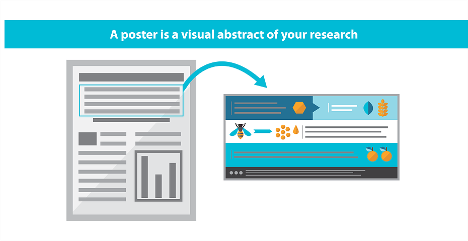
A conference poster is a visual abstract of your research. Shows an image of a academic paper highlighting the abstract section and an arrow pointing to how it can look visually as a poster design

As academics, we like to write using impossible words, passive tenses, and convoluted sentences. We believe this is the way it should be done and what makes us seem most intelligent. The reality is, this is a selfish way of writing and does not take the reader into account. So please, break this vicious cycle of selfish scientific writing and design your poster with the reader in mind from the start.

How? Let me show you.

The 4 Steps to design a conference poster:

  • Step 1: Script the poster

  • Step 2: Create the concept

  • Step 3: Design your poster

  • Step 4: Get your poster print-ready

Let’s get started:

Step 1 – Script the conference poster

Before you consider opening PowerPoint, or any other design software, open Microsoft Word.

Any word processor will do, but make sure that it has the ability to track your word count and checks your spelling. The latter is particularly important, as I learned the hard way by missing an award because of a bloody typo!

Target audience.

Ask yourself, who is my ideal audience for this poster? Is it other experts in your field, or perhaps the broader public? What is their level of understanding of the subject? This is an important question because if you put a bit of effort into making your poster understandable to the broader public, you automatically increase your potential audience and impact. Also consider that a poster written in plain English works with both experts and non-experts alike, while technical and complicated writing greatly limits your potential audience.

Bullet points

A poster should not look like a paper, therefore, bullet points are your friend. 200-word paragraphs on a poster would discourage even the most motivated, sober, and caffeinated conference attendant. Bullet points on the other hand are a lot less frightening. There is a trend among some academics to slap a solid 200-or-so word abstract right at the top of their posters. Let me set the record straight. This has to stop. Your whole poster is a VISUAL abstract, so it makes no sense whatsoever to put a solid block of text that no one is going to read at the top of your poster. Exception: If you’re ashamed of how terrible your data are and you don’t want people to look at your poster, then go for it, put that abstract at the top. It’ll do a wonderful job at keeping people at a safe distance!
Enrol in the poster design course to master your conference poster presentations

Use sections with headers

Because we are writing with the reader in mind, we want to make the logical flow of the sections as easy as possible for the viewer to follow. My advice is to have large, easy-to-read and numbered sections that cover the main pillars of the story, which typically are:

  • 1 – Background

  • 2 – Questions / knowledge gap

  • 3 – Methods (keep this to the bare minimum or skip it if you can)

  • 4 – Results

  • 5 – Conclusions

  • 6 – References and acknowledgements (smaller at the bottom)

fewer words.  

I know this is going to shock many of you, but you should keep your word count under 250 in total. Possibly <150 words. I’m serious. The harsh reality is that if your poster is wordy, people will ignore it. Less is definitely more.

Graphs.

I know that you’re proud of your amazing graphs (especially those fancy multi-dimensional plots with lots of colors). Unfortunately, I have a bad news for you. You need to leave most of them out. You need to carefully select only the very essentials. One or two graphs is better than three or four, and certainly better than eight or nine! When selecting the graphs to display, also ask yourself who your audience is. This is important because if you are using your poster as an outreach tool for the general public, then there is no point in including complicated graphs that no one is going to understand. However, things are different if you are showing your poster exclusively to an audience of experts. In that case, it’s safe to assume your audience can read your graphs.

Step 2 – Create the concept of your conference poster

Here is where the fun starts. Grab a piece of paper, or open up your design software, and make a first draft.
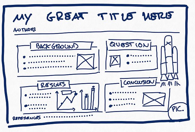
Example of a rough, drawn conference poster template to create the concept of your poster

Layout and size. 

Vertical or horizontal? You better check with the conference organizers, as you don’t want to show up at the conference with a poster that doesn’t fit the panels. A0 (841 x 1189 mm or 33.1 x 46.8 inches) is a good standard size to start. Keep in mind that when you design posters, it’s always safer to downsize than to upsize, as upsizing a digital image based on a pixel grid will inevitably cause a loss of resolution.

Panels. 

How do we read, left to right or right to left? Top-down or bottom-up? It may seem obvious, but I always see posters that are visually confusing and don’t have a clear directional flow. Start with an enlarged and readable title right at the top, then create a simple layout of panels that make it easy for the viewer to navigate. Remember that we’re committed to keep the reader in mind, so use arrows and numbered headers to help them out.

Shows different variations of panels for your scientific poster layout.

Leave space at the edges. 

Notice the grey space in the images above? It’s important to leave some blank space around the edges for a couple of reasons. First, you don’t want to risk important information to be cut off when printing, and second, you don’t want your poster to feel cluttered. This blank space is also known as negative space, and we’re going to unpack this concept more in the next section.

Step 3 – Design your conference poster

Negative space. 

For some strange reason, many academics feel the need to cover every inch of their poster with text or images. This is the wrong idea! It’s bad because it makes it difficult for the viewer to find the relevant information and to rest their eye. Clear space, also known as negative space, is a super important design concept, one that you should use to your advantage. Get ready for it. . . 40% of your poster should be clear. I am serious! 

Eye-catching visuals. 

Imagine you’re walking around a poster session, and you’re far enough away from the posters that you can’t read titles or graphs. What will compel you to walk towards a particular poster? It’ll likely be a recognizable image that grabs your attention. Without a big and recognizable image, your poster will look like a fuzzy wall of text and it will likely go unnoticed. Therefore, it’s smart to include one big visual that’s related to your research and has the ability to hook people in from a distance. Be it a rocket, a lion, or an octopus — what matters is that it’s there.

Color. 

This should be common sense. Yet, I often get my retina scarred by the most unbearable color combinations on scientific posters.
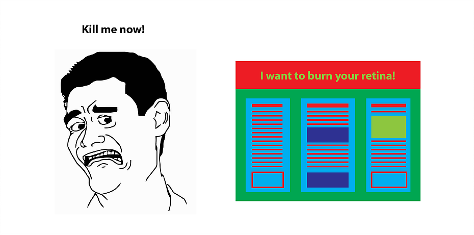
Two-panel image: left panel shows a distressed man with a comic-style speech bubble saying "kill me now!" right panel features a bright, clashing colored webpage mockup with text "i want to burn your retina!.

Use a limited number of colors, say three-to-five, and stick with them! Graphs included. My suggestion is that you have two or three shades of a primary color of your choice, an accent color that stands out, and a couple of text colors. In a color scheme of this kind, you can use the accent color to draw attention to where you want people to look. The important thing is that you use the accent color in moderation. Let me show you what I mean.
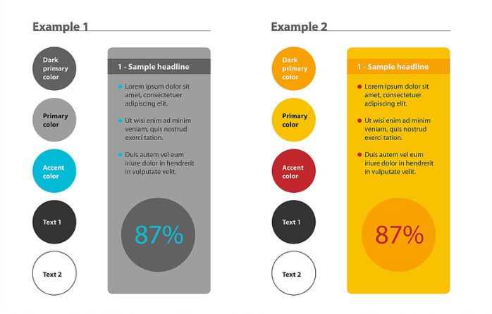
Two side-by-side graphic design templates comparing color schemes and layout. both include sample headlines, text boxes, color labels (primary and accent), and a large percentage circle. one has a gray background, the other yellow.

See how the 87% and the dot points stand out? This is the effect you want to recreate on your own posters. Feel free to steal these color schemes, and in case you need some more inspiration, Material Palette is a free tool that creates color palettes for you based on two colors of your choice.

Background. 

I know you have that awesome photo you really want to include in the poster. Why not blow it up and use it as the background of the whole poster?

GIF of bird shaking head back and forth no with the text NO.

NO! Don’t do it! You’re not doing yourself or the viewer any favours. A photo used as a background is too distracting and makes it impossible to have negative space on your poster. It’s much better to leave the background white, grey, or filled with a light color from your color palette.

Fonts. 

Fonts and font sizes work a bit like colors. That is, the fewer you use, the better. My suggestion is to use only one or two different fonts. Boldface should be used on titles and headlines, while all the rest should be normal. When picking what fonts to use, play it safe. Stick with the classic Arial, Myriad Pro, and other familiar fonts and you can’t go wrong. I know you’re tempted to use that super-original font that you’ve just discovered, but please, spare us. In terms of font size, try 90 for the Title, 60 for the headlines, and 36 for the body text. And remember that your poster should not require a magnifying glass to be read, but rather it should be easily readable from a meter away.
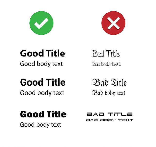
Graphic showing examples of good and bad text formatting. includes icons, headings, and body text in various styles with a check mark beside "good title" and an x beside "bad title".

Contact information. 

It may seem strange, but a lot of people forget to write their contact information on their posters. You may have a stunning poster, but how are people going to contact you and offer you a postdoc if you’re not around and your email is not on the poster? Even better, put a few business cards or a miniature A4 version of the poster (with contact info) beside the poster for people to take. This will have you looking very professional!

Photo. 

Most people don’t even think about this, but it’s a good idea to put a photo of you in one of the lower corners of your poster near your contact info. This is good practice as it makes the poster more human and even allows people to identify you and, if you’re lucky, buy you a drink because you impressed them with such a stunning poster. Hey, you never know.

Resources.

You’re probably not an artist, so where can you source quality visuals to put on your poster? Well, you can hire a professional scientific illustrator, or you can utilise one of the plenty free resources on the web. If you’re in the environmental sciences, the IAN image library is a great free library of graphics. Another great website to find free illustrations and icons is Freepik. Happy browsing!

Software. 

Some of you may be thinking that to make great posters you need great (and expensive) software. Wrong! All you really need is Microsoft PowerPoint and the principles contained in this blog post. Feeling like trying something more powerful? Then I recommend you check out Canva, and if you’re really up for a challenge use Affinity Designer, Adobe Illustrator or Indesign. However, be ready for a steep learning curve and a substantial investment on these latter options. On the bright side, Adobe always has significant educational discounts for students and university staff.

Step 4 – Getting your conference poster ready for print.

Get feedback. 

You’ve designed your masterpiece. Awesome! Congratulations! Now it’s time to get feedback from your supervisor and/or colleagues before printing it. Ask them to proofread it too. And remember that people are busy, so do this well in advance, as printing often takes longer than you’d imagine.

Dummy. 

Before spending money printing your poster, you really want to make a dummy as a final check. Print your poster A4, or even better A3 size if you can, and triple check that important information isn’t too close to the margins. You’re likely going to put your picture in a corner, so you want to ensure your face isn’t going to get cut in half!

Color profile. 

If you designed your poster with professional software, you’ll have the ability to control the color profile. Nothing complicated, there are two options: RGB and CMYK. The first one is for digital use, and the second one is for printing — pick the second one. That’s all you need to know.

Resolution. 

If you designed your poster big enough from the start (e.g. A0), you should be alright. As a rule of thumb, your resolution for high-quality printing posters and images should be around 300 dpi (dots per inch).

Where to print. 

You have many options, from the big office supplies stores like Officeworks, to the small print shops around campus. Print time varies from place to place, so be sure to plan this ahead of time.

Paper.

Shiny things are pretty, but it’s better to avoid shiny and glossy papers when it comes to posters, as they can create annoying reflections. Matte papers are best. But paper isn’t the only option these days, some stores can even print your poster on canvas or cloth.

Tubes and foldable posters.

The most common is to print your poster on paper which fits into a cardboard tube. This is fine if you don’t need to take you poster on a flight, but have you considered that the tube might exceed the standard carry-on size limit? There is a solution! Some stores like Officeworks can print your poster on soft cloth materials that you can fold into your suitcase! And in case your poster gets a little wrinkly, all you need to do is to iron it. I tried this and I was very impressed by the print quality. The colors looked great!

This was a long post with lots of information, so I’m impressed you made it this far! Now that you’ve learned these solid principles, you’re halfway there to making an award-winning poster.

Oh, and one last thing. Remember when I said that a poster is a conversation starter? It’s true, so you need to prepare and sharpen your pitch! Practice walking people through your poster in about a minute, and then start a conversation with them. How? Asking them what they work on is a good start. The secret to a good conversation is showing interest and listening. People love to talk about themselves and their research, so let them talk! It’s as easy as that.
How to design an award-winning-scientific poster. Enrol in the online poster design course to master your conference poster presentations.

About the Author

Headshot of a man on an orange background, Dr. Tullio Rossi

Tullio Rossi has a PhD in marine biology from the University of Adelaide. He is the founder of Animate Your Science, a company whose objective is to help scientists to get their work noticed and make a positive impact on society through the creation of video and graphical abstracts that are engaging, understandable, and shareable on social media. He is a rare breed: a marine biologist, graphic designer, and communicator all rolled into one. Tullio is Italian, but currently resides in Adelaide, South Australia. When he’s not helping scientists get discovered, he loves travelling to exotic places, exploring the underwater world, and dancing salsa!

Share this article:
Designing an Engaging Conference Poster Step by Step

Far too many scientists miss an opportunity when they present their posters at conference. In this guest post, Dr. Tullio Rossi from Animate Your Science gives step-by-step instructions to design an award-winning conference poster.

Before we get started, I want you to think about three things that you know about scientific posters. Think hard now.

Done? Great! Now erase those ideas from your memory. F O R E V E R. We need to start fresh.

The problem is that 90% of the scientific posters that you’ve seen at conferences and in the corridors of your university are TERRIBLE. I mean VERY TERRIBLE!!! Therefore, any ideas you might have about what a scientific poster should look like are probably, well. . . terrible. But it’s not your fault, and we’ll set things straight in this post, so hang tight!

First off, let’s make clear what a poster is NOT.

A poster is not a bottomless pit where you dump all of your data and technical lingo. Only carefully selected information and visuals should go into your poster. I know you have eight fancy 3D plots that you can’t wait to share with the world, but ask yourself, are they really necessary? Do you really need eight of them when just one would do the trick?

A template for conference posters

Now let’s talk about what a poster should be instead. Above all, a poster should be a networking tool. The primary purpose of a poster is not to communicate every little detail of your fantastic research, but rather to attract people’s attention and serve as a conversation starter. Think about the typical conference poster session; it’s at the end of the day, and there is often copious amounts of alcohol in the mix. Seriously, after a long day of presentations, no one wants to read walls of text as the wine kicks in. What they want is for you to share the story of your research and engage in informal conversation about it. Repeat after me, a poster is a conversation starter. And the poster is not going to do the talking for you.

Second, a poster is a communication tool. A poster should use visuals to draw people in from a distance. Then, as people step closer and begin reading it, go ahead and give the background information necessary so that they can put your work into context, understand what you have done, why you have done it, and come to realize its broader impact.

Does this ring a bell? It’s no coincidence that the key information you’d include in your poster is the same information that you’d find in any scientific abstract. And here’s the secret: a scientific poster is simply a visual abstract. It’s also known as a graphical abstract. A concise and visual summary of your research. Its purpose is to be accessible and to drive attention to your research.

A conference poster is a visual abstract of your research. Shows an image of a academic paper highlighting the abstract section and an arrow pointing to how it can look visually as a poster design

As academics, we like to write using impossible words, passive tenses, and convoluted sentences. We believe this is the way it should be done and what makes us seem most intelligent. The reality is, this is a selfish way of writing and does not take the reader into account. So please, break this vicious cycle of selfish scientific writing and design your poster with the reader in mind from the start.

How? Let me show you.

The 4 Steps to design a conference poster:

  • Step 1: Script the poster

  • Step 2: Create the concept

  • Step 3: Design your poster

  • Step 4: Get your poster print-ready

Let’s get started:

Step 1 – Script the conference poster

Before you consider opening PowerPoint, or any other design software, open Microsoft Word.

Any word processor will do, but make sure that it has the ability to track your word count and checks your spelling. The latter is particularly important, as I learned the hard way by missing an award because of a bloody typo!

Target audience.

Ask yourself, who is my ideal audience for this poster? Is it other experts in your field, or perhaps the broader public? What is their level of understanding of the subject? This is an important question because if you put a bit of effort into making your poster understandable to the broader public, you automatically increase your potential audience and impact. Also consider that a poster written in plain English works with both experts and non-experts alike, while technical and complicated writing greatly limits your potential audience.

Bullet points

A poster should not look like a paper, therefore, bullet points are your friend. 200-word paragraphs on a poster would discourage even the most motivated, sober, and caffeinated conference attendant. Bullet points on the other hand are a lot less frightening. There is a trend among some academics to slap a solid 200-or-so word abstract right at the top of their posters. Let me set the record straight. This has to stop. Your whole poster is a VISUAL abstract, so it makes no sense whatsoever to put a solid block of text that no one is going to read at the top of your poster. Exception: If you’re ashamed of how terrible your data are and you don’t want people to look at your poster, then go for it, put that abstract at the top. It’ll do a wonderful job at keeping people at a safe distance!

Enrol in the poster design course to master your conference poster presentations

Use sections with headers

Because we are writing with the reader in mind, we want to make the logical flow of the sections as easy as possible for the viewer to follow. My advice is to have large, easy-to-read and numbered sections that cover the main pillars of the story, which typically are:

  • 1 – Background

  • 2 – Questions / knowledge gap

  • 3 – Methods (keep this to the bare minimum or skip it if you can)

  • 4 – Results

  • 5 – Conclusions

  • 6 – References and acknowledgements (smaller at the bottom)

fewer words.  

I know this is going to shock many of you, but you should keep your word count under 250 in total. Possibly <150 words. I’m serious. The harsh reality is that if your poster is wordy, people will ignore it. Less is definitely more.

Graphs.

I know that you’re proud of your amazing graphs (especially those fancy multi-dimensional plots with lots of colors). Unfortunately, I have a bad news for you. You need to leave most of them out. You need to carefully select only the very essentials. One or two graphs is better than three or four, and certainly better than eight or nine! When selecting the graphs to display, also ask yourself who your audience is. This is important because if you are using your poster as an outreach tool for the general public, then there is no point in including complicated graphs that no one is going to understand. However, things are different if you are showing your poster exclusively to an audience of experts. In that case, it’s safe to assume your audience can read your graphs.

Step 2 – Create the concept of your conference poster

Here is where the fun starts. Grab a piece of paper, or open up your design software, and make a first draft.

Example of a rough, drawn conference poster template to create the concept of your poster

Layout and size. 

Vertical or horizontal? You better check with the conference organizers, as you don’t want to show up at the conference with a poster that doesn’t fit the panels. A0 (841 x 1189 mm or 33.1 x 46.8 inches) is a good standard size to start. Keep in mind that when you design posters, it’s always safer to downsize than to upsize, as upsizing a digital image based on a pixel grid will inevitably cause a loss of resolution.

Panels. 

How do we read, left to right or right to left? Top-down or bottom-up? It may seem obvious, but I always see posters that are visually confusing and don’t have a clear directional flow. Start with an enlarged and readable title right at the top, then create a simple layout of panels that make it easy for the viewer to navigate. Remember that we’re committed to keep the reader in mind, so use arrows and numbered headers to help them out.

Shows different variations of panels for your scientific poster layout.

Leave space at the edges. 

Notice the grey space in the images above? It’s important to leave some blank space around the edges for a couple of reasons. First, you don’t want to risk important information to be cut off when printing, and second, you don’t want your poster to feel cluttered. This blank space is also known as negative space, and we’re going to unpack this concept more in the next section.

Step 3 – Design your conference poster

Negative space. 

For some strange reason, many academics feel the need to cover every inch of their poster with text or images. This is the wrong idea! It’s bad because it makes it difficult for the viewer to find the relevant information and to rest their eye. Clear space, also known as negative space, is a super important design concept, one that you should use to your advantage. Get ready for it. . . 40% of your poster should be clear. I am serious! 

Eye-catching visuals. 

Imagine you’re walking around a poster session, and you’re far enough away from the posters that you can’t read titles or graphs. What will compel you to walk towards a particular poster? It’ll likely be a recognizable image that grabs your attention. Without a big and recognizable image, your poster will look like a fuzzy wall of text and it will likely go unnoticed. Therefore, it’s smart to include one big visual that’s related to your research and has the ability to hook people in from a distance. Be it a rocket, a lion, or an octopus — what matters is that it’s there.

Color. 

This should be common sense. Yet, I often get my retina scarred by the most unbearable color combinations on scientific posters.

Two-panel image: left panel shows a distressed man with a comic-style speech bubble saying "kill me now!" right panel features a bright, clashing colored webpage mockup with text "i want to burn your retina!.

Use a limited number of colors, say three-to-five, and stick with them! Graphs included. My suggestion is that you have two or three shades of a primary color of your choice, an accent color that stands out, and a couple of text colors. In a color scheme of this kind, you can use the accent color to draw attention to where you want people to look. The important thing is that you use the accent color in moderation. Let me show you what I mean.

Two side-by-side graphic design templates comparing color schemes and layout. both include sample headlines, text boxes, color labels (primary and accent), and a large percentage circle. one has a gray background, the other yellow.

See how the 87% and the dot points stand out? This is the effect you want to recreate on your own posters. Feel free to steal these color schemes, and in case you need some more inspiration, Material Palette is a free tool that creates color palettes for you based on two colors of your choice.

Background. 

I know you have that awesome photo you really want to include in the poster. Why not blow it up and use it as the background of the whole poster?

GIF of bird shaking head back and forth no with the text NO.

NO! Don’t do it! You’re not doing yourself or the viewer any favours. A photo used as a background is too distracting and makes it impossible to have negative space on your poster. It’s much better to leave the background white, grey, or filled with a light color from your color palette.

Fonts. 

Fonts and font sizes work a bit like colors. That is, the fewer you use, the better. My suggestion is to use only one or two different fonts. Boldface should be used on titles and headlines, while all the rest should be normal. When picking what fonts to use, play it safe. Stick with the classic Arial, Myriad Pro, and other familiar fonts and you can’t go wrong. I know you’re tempted to use that super-original font that you’ve just discovered, but please, spare us. In terms of font size, try 90 for the Title, 60 for the headlines, and 36 for the body text. And remember that your poster should not require a magnifying glass to be read, but rather it should be easily readable from a meter away.

Graphic showing examples of good and bad text formatting. includes icons, headings, and body text in various styles with a check mark beside "good title" and an x beside "bad title".

Contact information. 

It may seem strange, but a lot of people forget to write their contact information on their posters. You may have a stunning poster, but how are people going to contact you and offer you a postdoc if you’re not around and your email is not on the poster? Even better, put a few business cards or a miniature A4 version of the poster (with contact info) beside the poster for people to take. This will have you looking very professional!

Photo. 

Most people don’t even think about this, but it’s a good idea to put a photo of you in one of the lower corners of your poster near your contact info. This is good practice as it makes the poster more human and even allows people to identify you and, if you’re lucky, buy you a drink because you impressed them with such a stunning poster. Hey, you never know.

Resources.

You’re probably not an artist, so where can you source quality visuals to put on your poster? Well, you can hire a professional scientific illustrator, or you can utilise one of the plenty free resources on the web. If you’re in the environmental sciences, the IAN image library is a great free library of graphics. Another great website to find free illustrations and icons is Freepik. Happy browsing!

Software. 

Some of you may be thinking that to make great posters you need great (and expensive) software. Wrong! All you really need is Microsoft PowerPoint and the principles contained in this blog post. Feeling like trying something more powerful? Then I recommend you check out Canva, and if you’re really up for a challenge use Affinity Designer, Adobe Illustrator or Indesign. However, be ready for a steep learning curve and a substantial investment on these latter options. On the bright side, Adobe always has significant educational discounts for students and university staff.

Step 4 – Getting your conference poster ready for print.

Get feedback. 

You’ve designed your masterpiece. Awesome! Congratulations! Now it’s time to get feedback from your supervisor and/or colleagues before printing it. Ask them to proofread it too. And remember that people are busy, so do this well in advance, as printing often takes longer than you’d imagine.

Dummy. 

Before spending money printing your poster, you really want to make a dummy as a final check. Print your poster A4, or even better A3 size if you can, and triple check that important information isn’t too close to the margins. You’re likely going to put your picture in a corner, so you want to ensure your face isn’t going to get cut in half!

Color profile. 

If you designed your poster with professional software, you’ll have the ability to control the color profile. Nothing complicated, there are two options: RGB and CMYK. The first one is for digital use, and the second one is for printing — pick the second one. That’s all you need to know.

Resolution. 

If you designed your poster big enough from the start (e.g. A0), you should be alright. As a rule of thumb, your resolution for high-quality printing posters and images should be around 300 dpi (dots per inch).

Where to print. 

You have many options, from the big office supplies stores like Officeworks, to the small print shops around campus. Print time varies from place to place, so be sure to plan this ahead of time.

Paper.

Shiny things are pretty, but it’s better to avoid shiny and glossy papers when it comes to posters, as they can create annoying reflections. Matte papers are best. But paper isn’t the only option these days, some stores can even print your poster on canvas or cloth.

Tubes and foldable posters.

The most common is to print your poster on paper which fits into a cardboard tube. This is fine if you don’t need to take you poster on a flight, but have you considered that the tube might exceed the standard carry-on size limit? There is a solution! Some stores like Officeworks can print your poster on soft cloth materials that you can fold into your suitcase! And in case your poster gets a little wrinkly, all you need to do is to iron it. I tried this and I was very impressed by the print quality. The colors looked great!

This was a long post with lots of information, so I’m impressed you made it this far! Now that you’ve learned these solid principles, you’re halfway there to making an award-winning poster.

Oh, and one last thing. Remember when I said that a poster is a conversation starter? It’s true, so you need to prepare and sharpen your pitch! Practice walking people through your poster in about a minute, and then start a conversation with them. How? Asking them what they work on is a good start. The secret to a good conversation is showing interest and listening. People love to talk about themselves and their research, so let them talk! It’s as easy as that.

How to design an award-winning-scientific poster. Enrol in the online poster design course to master your conference poster presentations.

About the Author

Headshot of a man on an orange background, Dr. Tullio Rossi

Tullio Rossi has a PhD in marine biology from the University of Adelaide. He is the founder of Animate Your Science, a company whose objective is to help scientists to get their work noticed and make a positive impact on society through the creation of video and graphical abstracts that are engaging, understandable, and shareable on social media. He is a rare breed: a marine biologist, graphic designer, and communicator all rolled into one. Tullio is Italian, but currently resides in Adelaide, South Australia. When he’s not helping scientists get discovered, he loves travelling to exotic places, exploring the underwater world, and dancing salsa!

Share this article:

© Copyright 2018-2024 by Anna Clemens. All Rights Reserved. 


Photography by Alice Dix