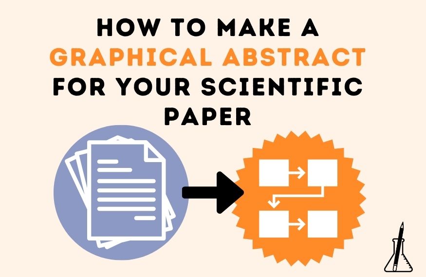
More and more journals are requiring a graphical abstract when you are submitting your scientific paper. But what is a graphical abstract and how to make a graphical abstract for your scientific paper? In this blog post, multimedia science communicator Dr Gaius Augustus shows you three graphical abstract examples with different graphical abstract designs and answers the most common questions researchers have about graphical abstracts.
Your experiments are finished, your figures created, you’ve even written up a nice manuscript to submit to your target journal. You take a moment to pull up the formatting guidelines from the journal website. Everything seems to be in place – except for that one nagging requirement: a graphical abstract. Let me show you how you can get the most out of your graphical abstract!
WHAT IS A GRAPHICAL ABSTRACT?
A graphical abstract or graphical summary in its pure form is a visual representation of the abstract of a scientific paper. I typically see graphical abstracts in two places: social media and journal websites. While journals usually have some guidelines on the length and format of abstracts, there are often no strict guidelines for graphical abstracts.
There are several schools of thought on what information one should put in a graphical abstract. Some suggest including everything that is part of the written abstract, such as background information, the problem the study is solving, as well as the results, conclusions and implications of the study, and perhaps even the methods that were used. However, graphical abstracts don’t come up in search engines for the scientific literature, such as PubMed or Google Scholar. So, one cannot expect them to take the place of a written abstract. Instead, I tend to think of a graphical abstract as a visualisation that gets across the main idea of your paper.
Instead of including information about experiments you performed or results you obtained, I believe your graphical summary should complement your written abstract. It should give readers a quick overview of how the results fit together into a conceptual or empirical framework, and how that framework impacts your scientific field. Ideally, a graphical abstract provides some background on the research question and gaps in the literature. I recommend you to only mention the methodology if it’s crucial to understand the results. It is best to choose one main graphic that is either the most compelling piece of data or a model that integrates the data into one figure.
HOW TO MAKE A GRAPHICAL ABSTRACT?
There are graphical abstract designs that are most effective for communicating research:
- Flow diagrams
- Visual systems models
- Visual representations of the proposed model (such as a cartoon)
Let’s take this abstract as an example:
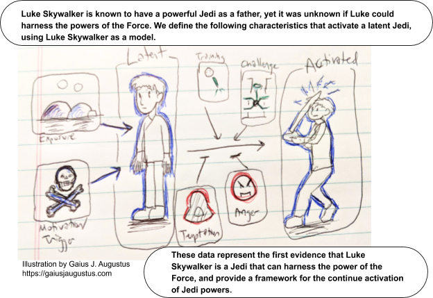
Luke Skywalker, a young orphan living with his uncle on Tatooine, is recruited into the Resistance by Obi Wan Kenobi, the last living Jedi master who has been in hiding from the evil Empire on the remote planet. Luke is informed that his father was a powerful Jedi and is given his father’s lightsaber. It is unknown whether Luke is a Jedi too and whether he can harness the power of the Force. Here, we show that Luke Skywalker is a Jedi who can harness the power of the Force. Through providing training by Obi Wan and challenging Luke through simulated and real battle experiences, we found that in the absence of visual senses, Luke was able to predict the path of incoming lasers and to accurately target a missile. Our findings support a model that exposure and motivation can activate the latent Jedi in the presence of training and challenges but can be hampered by temptation and anger. Overall, this study provides a theoretical framework for the development and activation of a latent Jedi, potentially impacting the ability of the Resistance to challenge the Empire.
How does this translate into the different graphical abstract designs? Let’s consider the first of our graphical abstract examples, a flow diagram of the above abstract:
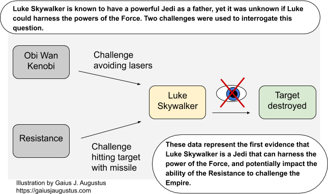
It uses simple shapes such as squares, arrows, and crosses to describe the process. This graphical abstract is rather text-heavy, but the flow diagram gives a decent indication of the methods used, their results, and the impact of the experimental variable.
Want the process of writing a scientific paper feel more streamlined (beyond the graphical abstract)? Ready to feel more confident in your writing skills so you can share your work with a broader scientific audience?
You are in the right place. Join me in this free 1-hour long training session and have me walk you through my step-by-step paper writing system. Click the orange button to watch now or register to watch later.
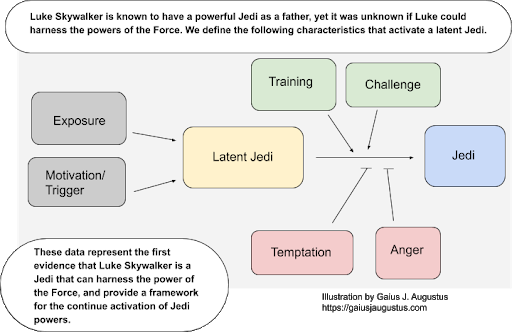
The next one of our graphical abstract examples is a visual systems model. It is based on the idea of “what makes a Jedi” and divides it into the factors that activate (green, arrows) or inhibit (red, “T’s”) becoming a Jedi. Notice how this graphical abstract doesn’t include the exact experiments performed and instead focuses on the big picture:
On to the last one of our graphical abstract examples, the visual representation. A cartoon model can bring your particular study into the context of the full model:
Here we see visual representations of the specific experiments and variables of our study while using the language of a more general model. This graphical abstract design also allows you to add personality to your graphical summary.
So, now you got three graphical abstract examples: the flow diagram, the visual system model and the visual representation. But these are not the only graphical abstract designs! Your perfect graphical abstract will be dictated by both your field and your imagination. I want to encourage you to think outside of the box. Find ways to visualise your research topic in your graphical summary that are clear and concise, and support the written abstract.
HOW TO MAKE A GRAPHICAL ABSTRACT – COMMON MISTAKES
Before you now get started on your graphical abstract, I want to warn you about the five most common mistakes I see around:
- Being too vague. This applies to all parts of your graphical summary, e.g. what you did, how your results fit into the model, and why your study is impactful
- Using images flippantly. Every graphic should have a purpose, and a reader should get a general idea of what your scientific article is about from looking at the graphical abstract
- Using too much or not enough colour. Colour is important as a way of highlighting concepts and flow. It’s useful for organisation as well. But don’t overdo it. Make sure you are using colour with intention in your graphical abstract.
- Too much text. If your graphical abstract has as much text as your written abstract, it’s probably overcrowded.
- Not enough white space. White space is the “breathing room” around any piece of text or image, and it’s incredibly important in order for readers to grasp the content of your graphical abstract quickly. Give every element in your graphical summary space and ignore that itch to fill every pixel with something useful.
COMMON QUESTIONS ABOUT GRAPHICAL ABSTRACT DESIGNS
We now tackled the questions “What is a graphical abstract?”, “How to make a graphical abstract?” and I showed you three graphical abstract examples. But you may have some more questions about making a good graphical abstract design. Here are the answers to questions about graphical abstracts I get all the time:
WHAT PROGRAM SHOULD I USE TO MAKE MY GRAPHICAL ABSTRACT?
You can use any program you want to make your graphical abstract. You can draw with ink/marker and take a picture with your phone. You can use a drawing program such as Adobe Photoshop, Canva or the free and open-source tool Krita. You can also use a vector drawing program like Adobe Illustrator, Inkscape, or Affinity Designer. The images for this post were made using Google’s drawing tools inside Google Docs. Just remember: Getting a fancy program is not going to make your graphical abstract look better, especially if you haven’t given yourself enough time to gain some skill at it.
WHAT IMAGE SIZE AND FORMAT SHOULD I USE FOR MY GRAPHICAL ABSTRACT?
This should be defined by your journal. If they give you too much freedom, ensure that whatever size you choose has a sufficient resolution at print quality (minimum of 300dpi). Make sure the text is legible without having to zoom in extensively. When in thumbnail view, your graphical abstract shouldn’t look too busy. If the journal doesn’t specify, export the image as a TIF or PNG.
SHOULD I HIRE AN ARTIST TO CREATE MY GRAPHICAL ABSTRACT DESIGN?
If you’re unsure where to start with your graphical summary, you should definitely consider hiring someone to help. There are various artists who can translate your research into a graphical abstract. Just a little tip: Working with someone who has a scientific background may make the process less burdensome.
I hope you got a lot out of these tips! Graphical abstracts are a terrific new frontier that I hope will encourage scientists to think of better ways to visually communicate their research. Good luck!

Quick question. Do your writing and publishing goals sound anything like this:
- Make writing more efficient,
- Make your papers easier to read,
- Reduce the time you edit your students’ work?
If you nodded at least once, then this 60-minute class is for you! You can get access immediately or save your seat to watch it later. Just click the button.
👇🏽👇🏽
ABOUT THE AUTHOR:

Gaius J. Augustus is a multimedia communicator. Trained in fine arts and video production, Gaius switched career tracks to pursue a PhD in science. He now works to communicate science to the world with beautiful infographics, illustrations, and animations. Along the way, he shares what he has learned in hopes that he can improve the public opinion of science by making science more visual and engaging. To get in touch, check out his website or reach out via email: [email protected].