
You’ll quickly lose your audience if your plots are cluttered, confusing or hard to decipher. Don’t miss the free checklist to download in this post.
Communicating complex concepts isn’t easy. Especially when you are only given twenty or thirty, or even ten minutes to present your research in a scientific conference. Visualising your data can make it a lot easier for your audience to grasp the findings. However, there are some pitfalls. In my work with scientists I have noticed a few things researchers often get wrong when they present their graphs. Here are the ten most common mistakes you should watch out for:
1. Your graphs don’t have a clear message
Decide on one main message that you want to communicate with each figure you show. This message should be in tune with your conclusions and the overall message of your presentation. When you follow through the next steps, think about the message of your graph in each decision you make.
2. You haven’t chosen the most suitable plot type
Choose a plot type that conveys your message in the simplest and most accurate manner. This could be a bar chart, a scatter or line plot, a heat map or a histogram. If you are unsure, show your graph to a colleague and check whether their interpretation of your data matches your intended message.
3. You haven’t been selective enough
When you select the data that you want to present in your graph, be minimalist. Put as little data in as few figures as needed to accurately represent your findings. You recorded several sets of reproducible data? That’s great to mention to your listeners in a half sentence but there is no need to visually bombard them with all of this. Including error bars can sometimes be a way to reduce the number of data series (and is always encouraged anyway). If you still need to show a large number of data series, consider splitting them up in two plots that you show one by one.

4. The axis intercepts aren’t appropriate
Play around with the axis scales to find the section that captures your message most accurately. For example, if you need to display an absolute magnitude, showing the whole scale might be most suitable. If you want to show the difference between various data points or series, a zoom into the section where this difference becomes visible would be the way to go. When you adjust the axis ranges, always make sure to not distort the data to mislead your audience. To not waste any space available, let your data fill the whole plot.
5. Your plot is cluttered
The simpler your plot, the easier and quicker your audience will grasp it. In some data visualisation programs, the default options are full of clutter. So, remove everything you can from your plot while still telling the same message. That holds true for 3D effects, background grids and shading, excessive tick marks, frames around legends etc. If you only have a few data series, it might be appropriate to skip the legend and put labels right next to the graphs. Another thing to bear in mind is to choose a 2D over a 3D plot whenever possible – perhaps a second y-axis would do the trick?
Let me show you what I mean. Have a look at this figure:

What’s the message of this graph? It’s hard to tell right away, isn’t it? Not only are the font sizes ridiculously small – in fact this is the default size in Excel. See mistake no. 9 for more info on font sizes. There is also a lot going on in this plot: 3D effects, gridlines, background shading, a legend etc.
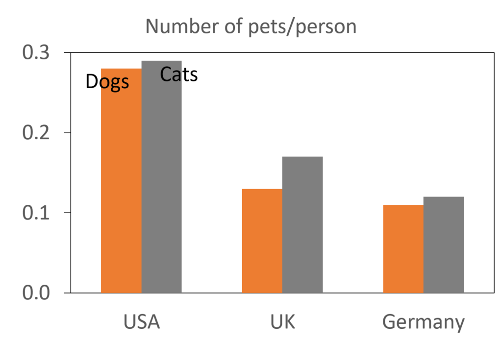
Now, what do you think about this plot:
Here, I adjusted the default settings of Excel, which makes the graph a lot clearer. You should now be able to grasp it more quickly. By the way, this is real data. Apparently, people like cats better than dogs (weird, right?) and the US are obsessed with pets!
If this was in a presentation you could use the animation feature: Start with only showing and discussing one data series and have the second data series appear after that. In this way, you can talk your audience through all the points you want to make bit by bit without distracting them.

6. Your axis titles and legends are confusing or repetitive
Try to find titles and descriptions for your plot that one can understand quickly, and that are consistent with how you have referred to variables etc. in the rest of your presentation. If you use a lot of different acronyms in your talk, it might be a good idea to spell them out in the axis titles. Show some sympathy with those people in your audience who have just woken up from their nap or simply missed a definition when they were making notes. Is it needless to say that units always have to be included? In your legend/key, I suggest you leave out any unnecessary information. For example, instead of repeating “current voltage curve 1st run”, “current voltage curve 2nd run” and “current voltage curve 3rd run” in your legend, you can simply label the data series “1st run”, “2nd run” and “3rd run”.
7. Your design is inconsistent
A clear and consistent design in your figures will make it easy for your audience to gather the presented information. For this, I suggest to use the same colour and symbols for each variable throughout your whole presentation. Sample 1 is displayed as red triangles on slide 7? Make sure it is on slide 13 too. Do also use your font, font size, marker size, line size etc. consistently. Use a font size of at least 30 pt. for axis titles, legends, text boxes etc. If you show different panels in your figure, use a design trick: Imagine an invisible grid in the background (or make it visible in the program you use) so that all panels are aligned.
8. You use colours randomly
There are better and worse colours you can use in your plot. Firstly, avoid colours that are hard to see on the screen, such as yellow or beige. In order for colour blind people to be able to read the figure, don’t use red and green together. If you need many different colours, for example for a heat map, experts don’t recommend the rainbow colour scale. More intuitive are the different colour schemes provided by the website Color Brewer that distinguish between sequential, diverging and qualitative data. Another point to keep in mind is that we often connect different meanings to different colours. For instance, we typically interpret darker colours as “more” and blue as more abstract.
9. You forgot to add necessary extras
No, this isn’t a contradiction. Although we aim for an as simple figure as possible, we still want to assist your audience with interpreting it. Perhaps a curve fit or a line as a guide for the eye would be helpful to see trends? Or does your graph show different ranges that could be divided by using dashed vertical or horizontal lines? Do the ranges correspond to different states in your model system that can be visualised with a simple graphic or scheme? Include them then! Your audience might also be grateful for arrows or a zoom into a specific region. Do everything necessary to ensure they’ll get your key message. To not clutter things up (see mistake no. 5), animations are your magic here. Simply add features one at a time while you explain them and your plot won’t seem overwhelming to your readers.
10. You copied your graph from your paper
I know. You’ve put so much thought in your graph to make it perfect. It’s ready, sitting there in your paper. A simple copy paste would do… If you care about the people who came to see your talk, don’t! First of all, the font and symbol size (see mistake no. 7) won’t be suitable for a presentation. Also, you are missing a chance to introduce the presented information bit by bit using an animation (see mistake no. 9).
There you have it. Are you ready to create amazing graphs in your next presentation?
This blog post originally appeared on Echo Rivera’s blog and is an adapted version of an article previously published on this blog.